By Kit Cheuk from Not Available
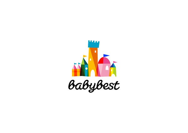
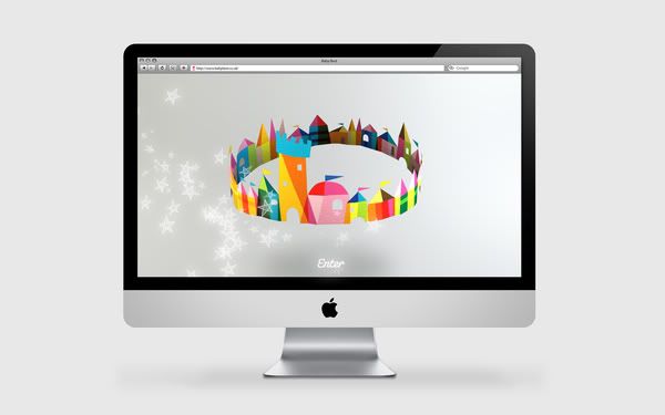
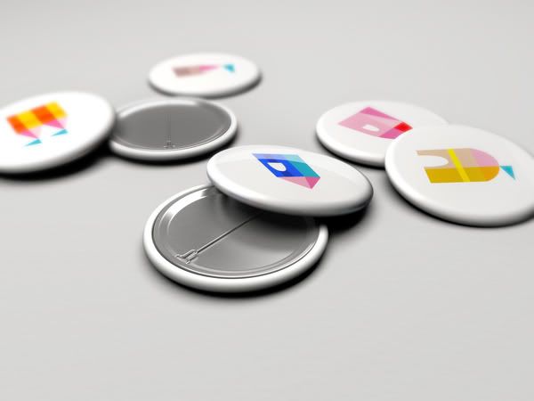
Remember those wooden building blocks you played with when you were a
child? This is what the identity reminded me of when I first saw it. I don’t
often see a logo with a whole spectrum of colours, and where it still looks
clean. This one is one of the few ones, I think. I really love the idea of
building a whole baby town… well kingdom, really.


No comments:
Post a Comment